The 4 most beautiful websites I've come across recently
I will show you 4 beautiful websites that recently caught my attention.
Every now and again as I surf the web I come across a few websites that make me say: “dammmnnnnn that’s nice”.
Just like a car enthusiast when they see a classic and rare car go past, as a web developer well-designed websites catch my eye.
Without any further ado, here are the 4 websites.
Disclaimer: I am not affiliated with any of the organisations mentioned, I earn no commissions, I added no affiliate link, and I am not endorsing any of the websites or their services. I like beautiful websites and that’s all.
Gumroad
Website: https://gumroad.com/ - Viewed on 07/11/2023
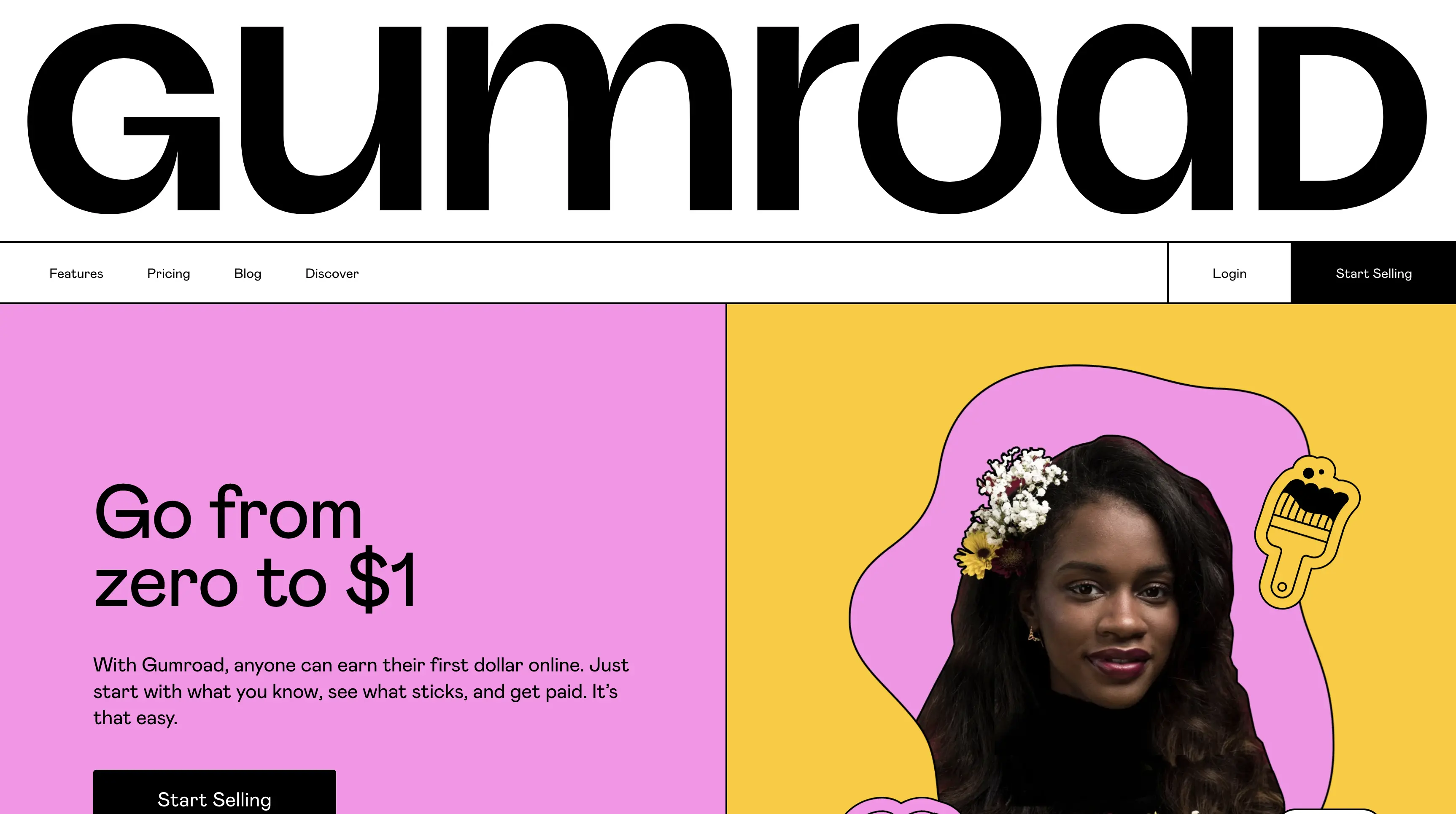 Gumroad homepage.
I found Gumroad because a client of mine wanted to create an online membership system with a tight budget. I found Gumroad and fell in love… with the design! Whoever led the design team for Gumroad created an excellent home page. It flows very nicely and really leaves an impression of how much effort the designers put into it.
Design choices I liked:
- Parallax Scroll: Tasteful parallax scrolling that makes the page seem alive.
- Contrast: Excellent contrasting with the colour scheme.
- Tells a Story: As you scroll the page section by section it flows as if it tells a story of the company.
Unsplash
Website: https://unsplash.com/plus - Viewed on 07/11/2023
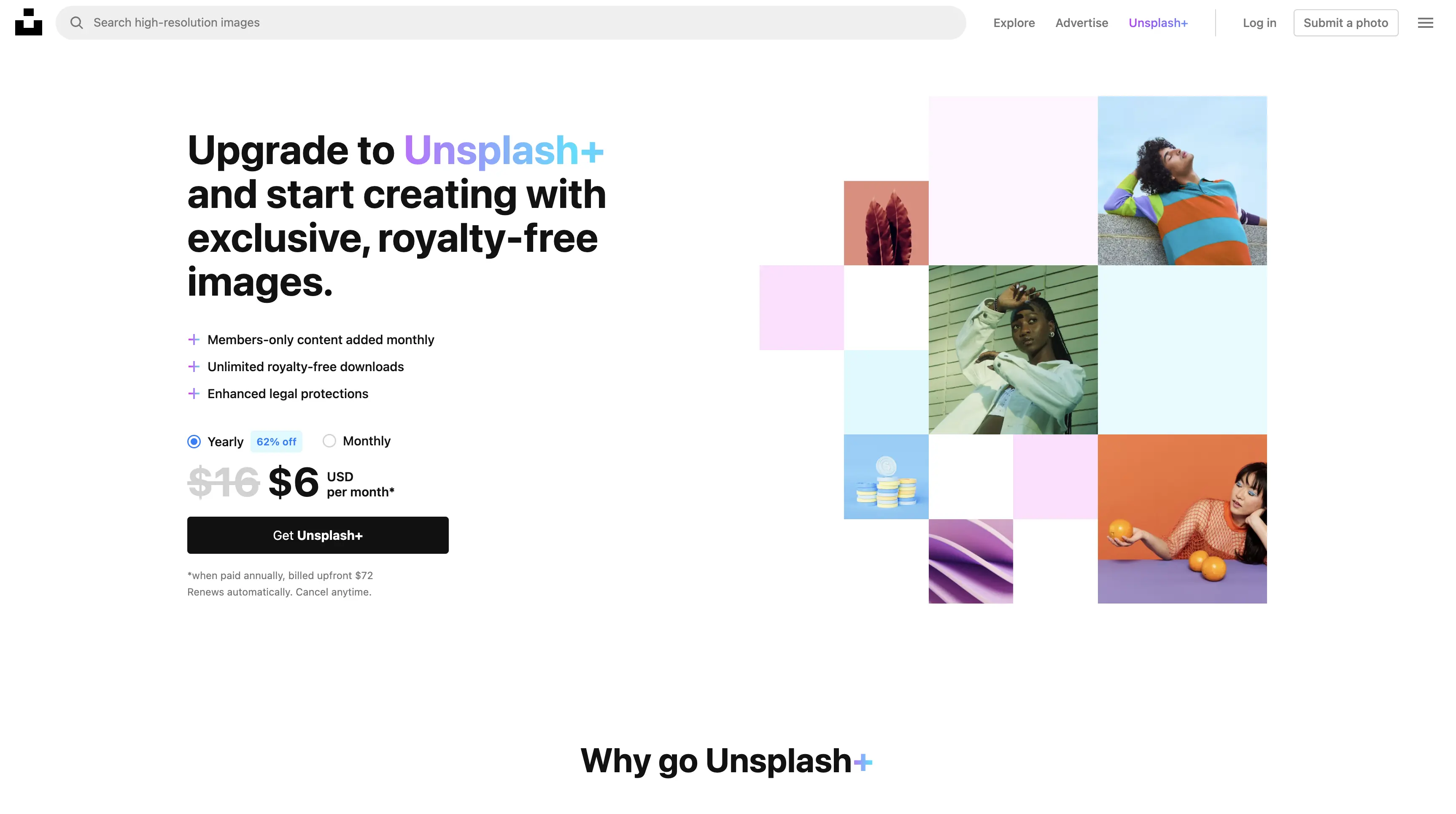 Unsplash Plus landing page.
I found Unsplash because I sometimes use their collection of royalty free stock images. When I clicked on their premium Unsplash plus service I almost fell out of my chair (exaggeration). So simple, so elegant, so expressive, I love it. I wanted to sign up for a premium account based on the design alone.
Design choices I liked:
- Whitespace: The designer didn’t try to fill every pixel on the screen, they utilised white space to create elegance in the design.
- Full Width Gallery: An image gallery with some photos flowing outside the bounds of the website to create an infinite effect.
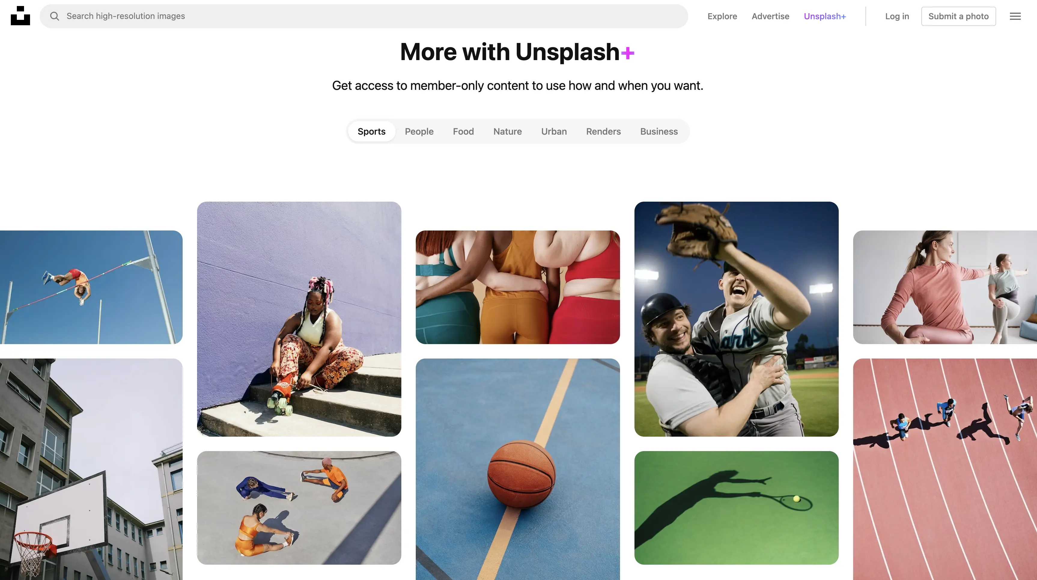 Gallery from Unsplash Plus.
 - Colour For Importance: Several sections utilised colour to differentiate their level of importance. E.g. white text for a title and an off grey for descriptions.
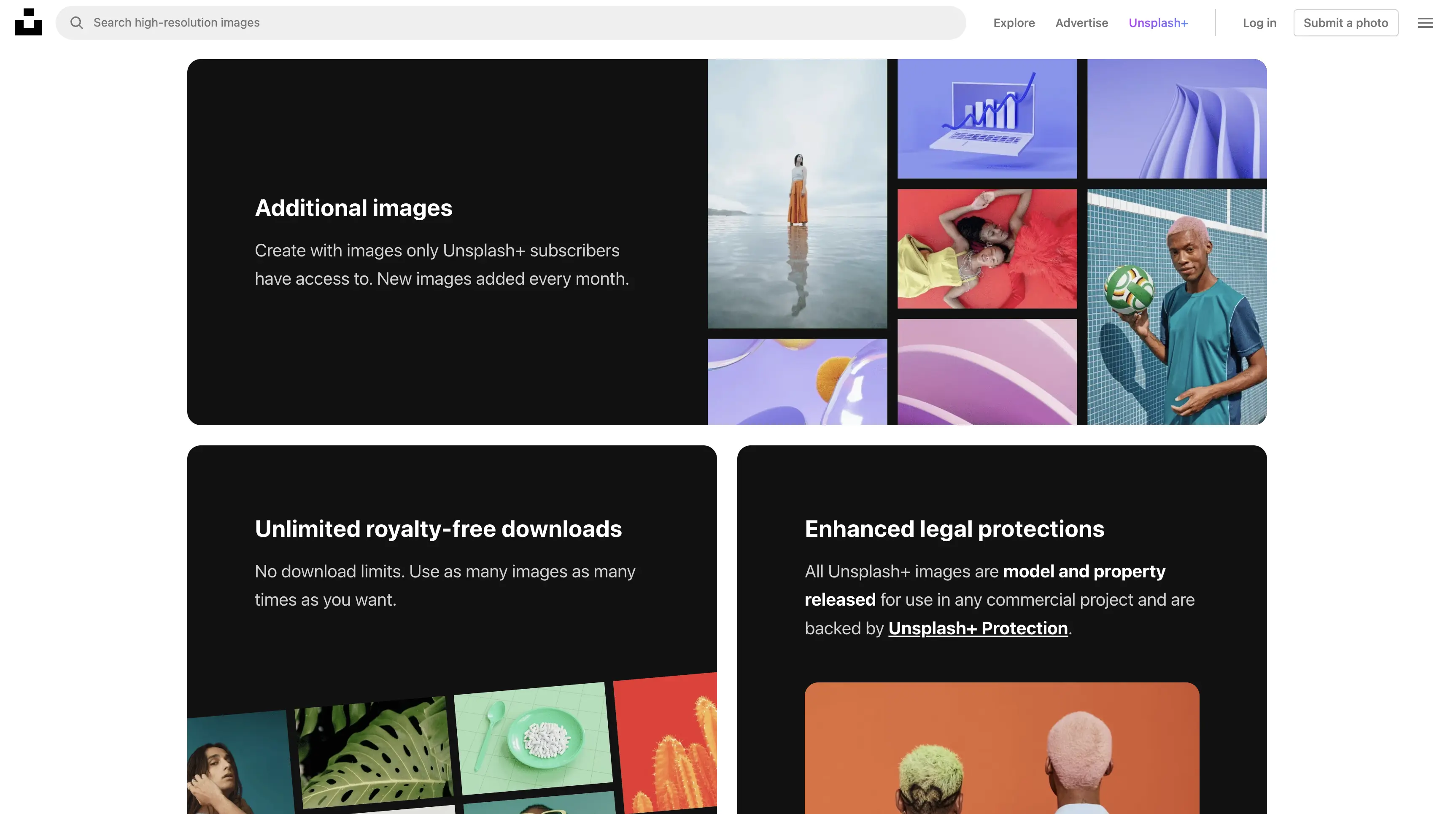 A few sections from Unsplash Plus.
Ghost
Website: https://ghost.org/ - Viewed on 07/11/2023
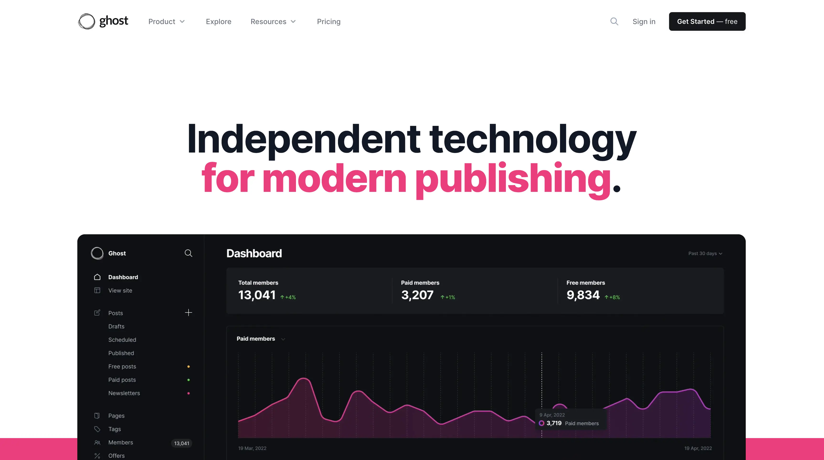 Ghost landing page.
Alright, now this just looks sleek! I was researching some website frameworks and tools and came across Ghost. Ghost provides some type of website creation platform, I am not expert on their service, instead I am an expert on loving their design (whatever that means)!
Design choices I liked:
- Animated Sections: The designer of the website sprinkles video elements that appear like dynamic animations. It makes the website feel alive, similar to Gumroad.
- Beautiful Imagery: The website contains beautiful, sleek, and crisp imagery. It makes the website feel high quality and really pop especially with the hot pink and lime colours.
 Imagery from Ghost homepage.
 - Readable Text: Finally a website that I don’t need to zoom in or squint my eyes. Bold, readable, and clear text, thank you Ghost.
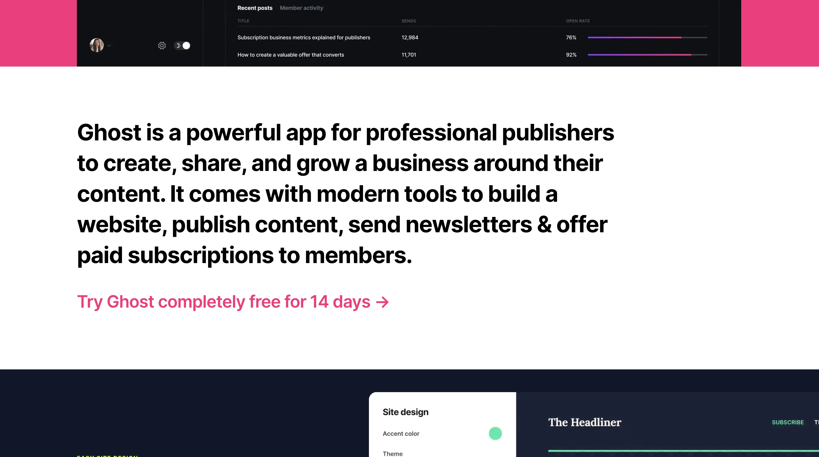 Example text from Ghost homepage.
Raycast
Website: https://www.raycast.com/ - Viewed on 07/11/2023
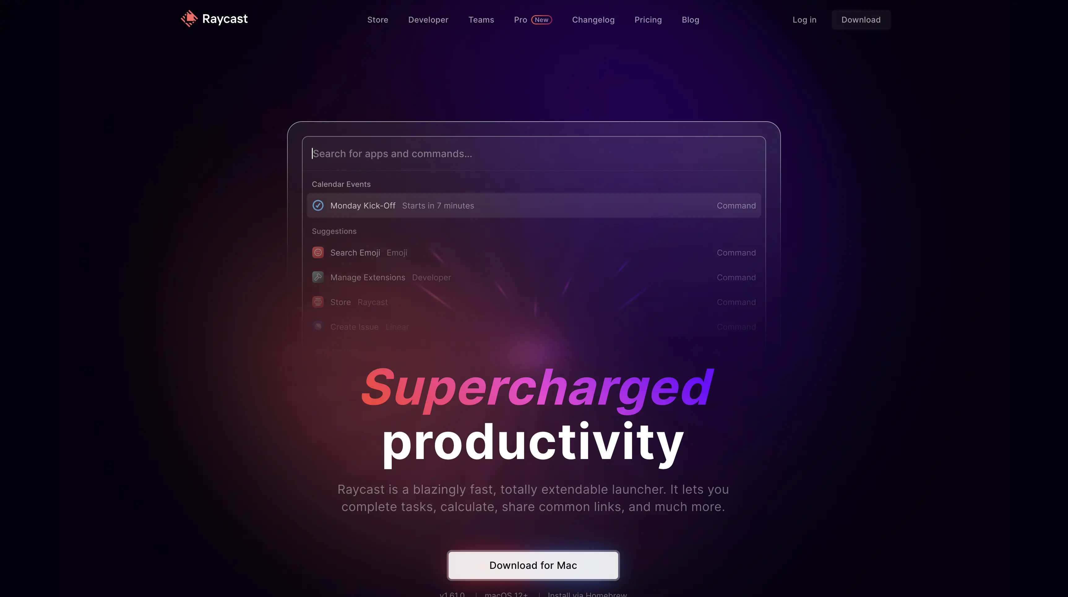 Raycast landing page.
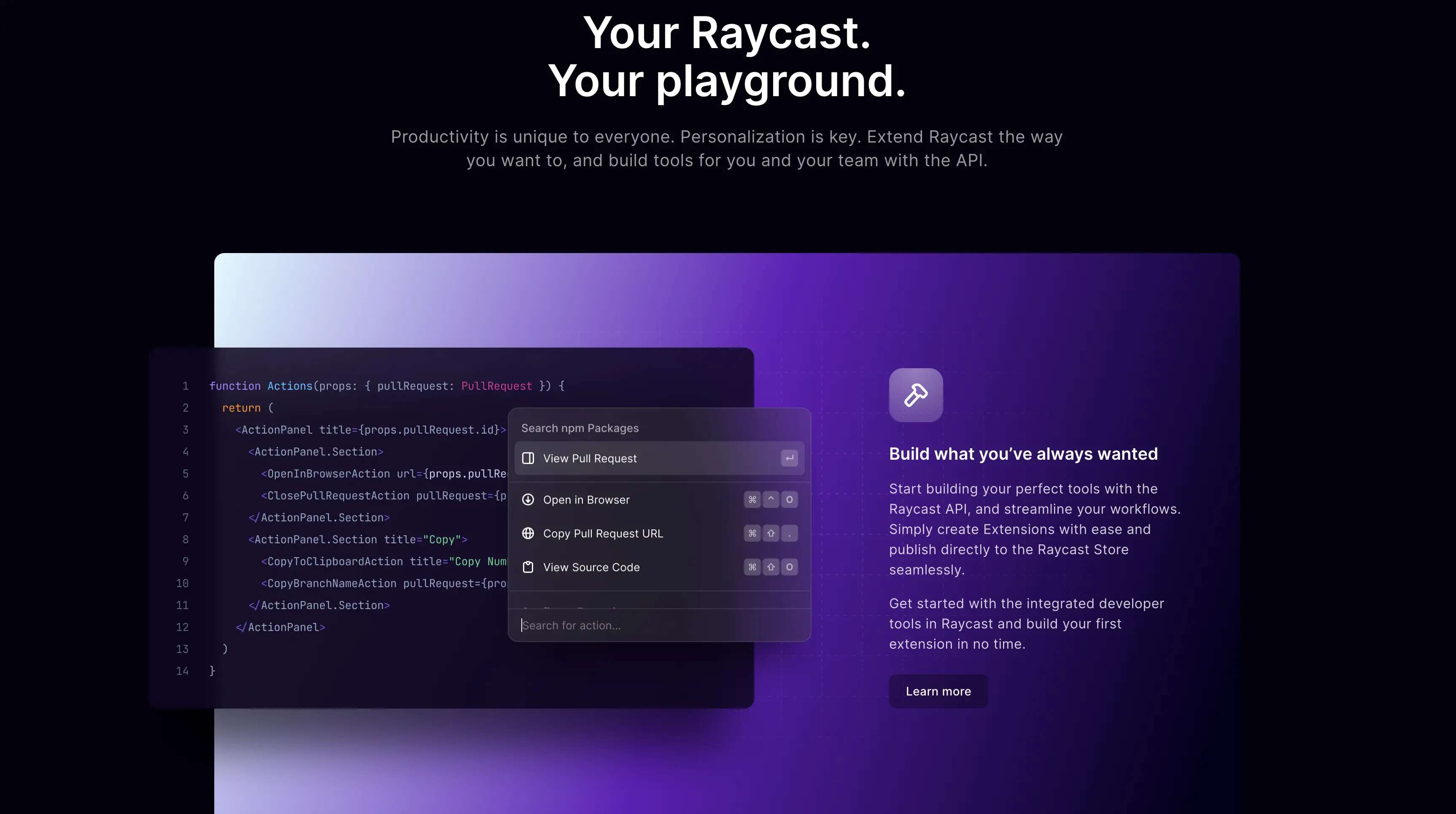
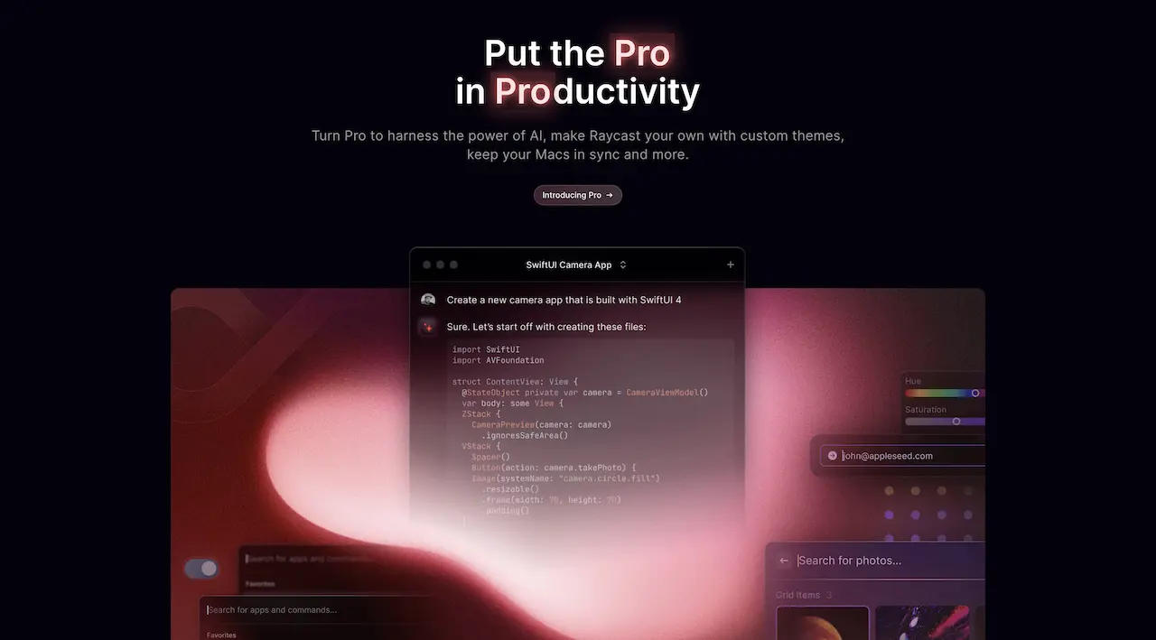
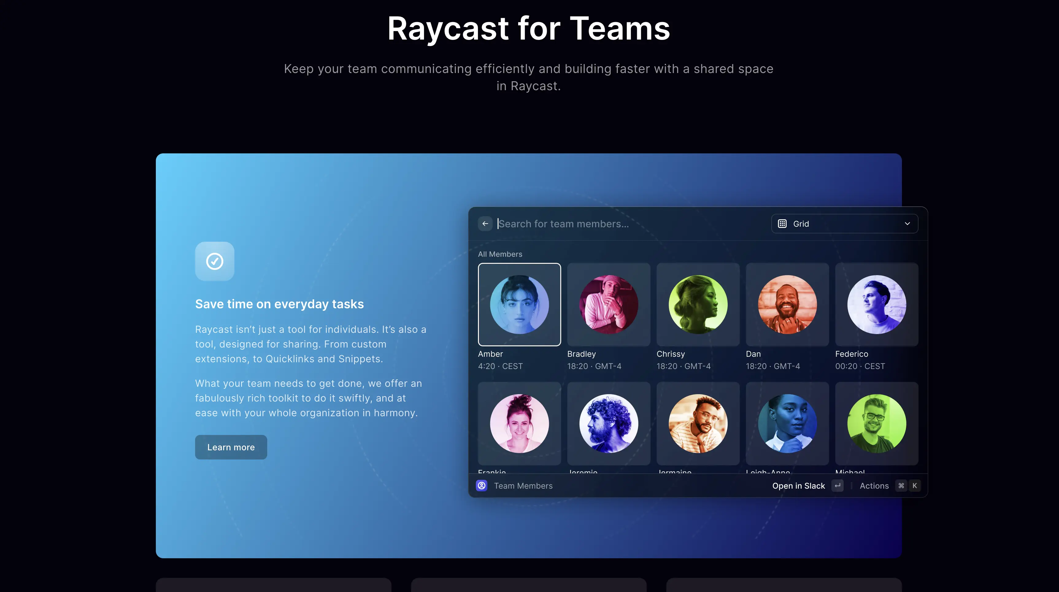
I was looking for a platform to automate some task on my Macbook and came across this beauty. Hands down, Raycast comes in at the number 1 for the most beautiful websites I have seen lately. When I opened the website I felt amazed. A unique, powerful, and sexy sleek website. Raycast builds a tool for MacOS automations but I think they should pivot away from that and instead design websites for other companies. Just wow.
Design choices I liked:
- Use of Gradients: This website uses gradients in a way that makes an impact. Sometimes gradients come out cheesy or looking like it was done in Microsoft Word 2007. Not this website, it gives a sleek and modern feel.
 Gradients from Raycast.
 - Unique touches: The website contains a bunch of features I have never seen before on a website. For example, in the image below they add a highlight glow effect to their text. The small unique touches put this website in another league.
 Glow effects from Raycast website.
 - Patterns: If you look closely at each of the different sections of the website you will notice textures in the backgrounds. It’s not just a solid colour background, instead it has a small touch that really adds a lot of depth.
 Patterns from Raycast website.
Send me your beautiful website
I love beautiful websites, just like some people love beautiful cars. I hope you also liked the 4 beautiful websites that I stumbled upon. If you see a beautiful website in the wild or know one off the top of your head then please send it to me at [email protected], I’d love to see it!