Mar 3, 2026
Creating Services Pages for Luciano Concrete's website
Today I would like to take you on the journey of how I designed and implemented service pages for Luciano Concrete, a local Adelaide concreter in South Australia. These pages were handmade with HTML, Tailwind CSS, and JavaScript, as we do for all our client websites. They are part of the whole Luciano Concrete website assigned to me by Sav, one of our co-founders and lead devs of Sanico Software, who also mentored me throughout the whole process.
Luciano Concrete was founded by Robbie, a 3rd-generation concreter. Having helped his Nonno and Father (1st and 2nd generation) during school holidays and weekends, Robbie has a wealth of concreting experience and is relationship-oriented with his clients. By making it custom-made instead of using a cookie-cutter template, I was able to better reflect this in a more personalised website, and tailor it to the design tastes of the client more closely.
These service pages are not just helpful for communicating to potential clients what Luciano Concrete could do to help them (and explaining all the concrete terminology and services to those of us who aren’t concreters or builders), but also helps Google and other (potentially AI) search engines discover the company and how they can help the searcher.
So let’s get right into it!
Finding inspiration
Before I started creating the service pages, I browsed the internet to find some inspiration for its design as Sav requested. The key word here is inspiration, as I am not looking to copy their pages, but noting down things that I liked about them and adapting them to my design. (In the creative business, you’ll soon realise the truth to the saying “everything is a remix”.)
Unfortunately, it was difficult to find aesthetically-pleasing concreting websites, as most don’t put in the resources to designing a good website. It is understandable, as many concreters are small businesses who don’t have much resources. Here are a few snippets of what I found to be nice though.
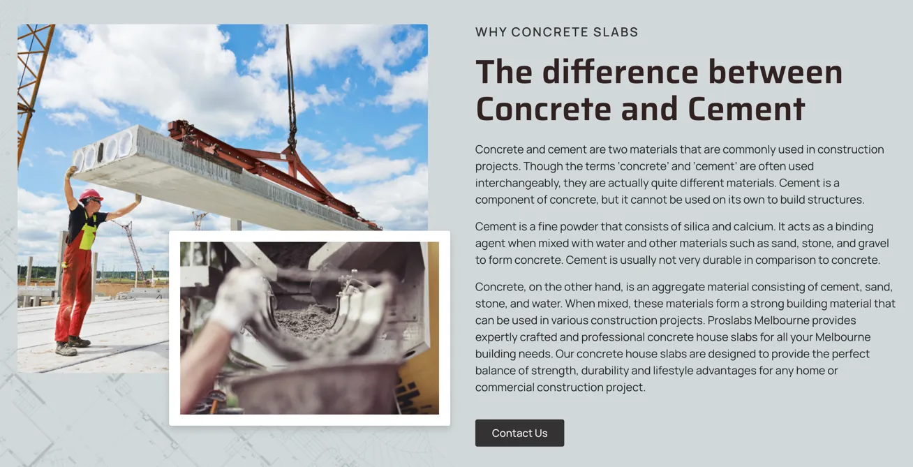
The first thing I found was these overlapping images on the Proslabs Concrete Slabs service page. I liked how the overlapping image slides in from the side, and how the overlap creates some depth to the page. The border helps with distinguishing the image from the background too.
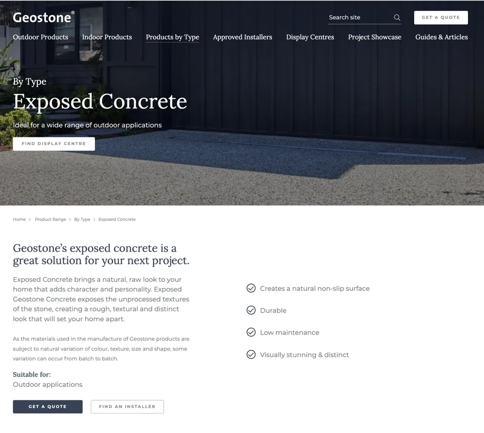
The second thing I found was the left-aligned hero design on non-home pages, as well as the well-aligned and laid-out typography on Geostone’s “Exposed Concrete” page. It looks professional and is very easy to scan as it is well-aligned and uses bullet points and different text styles throughout the page to establish a visual hierarchy.
Creating an MVP
Creating something from a blank canvas is hard, including this blog post. Which is why Sav suggested me to create a “blog dump” as I was creating Luciano Concrete’s service pages. This also happens to be the same approach I used to start creating those service pages, namely to get something on that canvas as quickly as possible by using previously made components. I prioritised getting all the content on the page first, because unlike a physical canvas, it is possible to tweak the painting after it has been painted on the canvas, and I find it much easier to tweak a painting then painting something perfectly from scratch. This was definitely the case when I started off with the hero, where I was quite perfectionist with it, taking me a while to finish it before actually getting any content on the page.
Typically, before slapping stuff onto a page, I would first create a design prototype, whether it’s a pencil prototype for a low-fi (low-fidelity) prototype or a more full-blown Canva or Figma high-fi (high-fidelity) prototype. However, due to the limited time constraints, I decided to jump right into slapping stuff onto a page with only a list of the page’s sections in mind. There were already components from other pages of the website too by this point so it was easier to do.
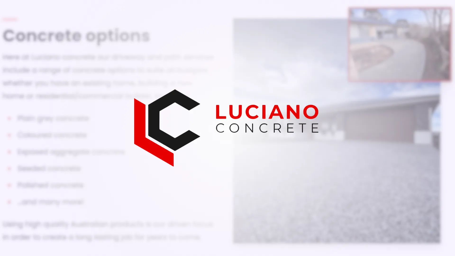
With the aforementioned inspiration in mind, I took a look at the minimum viable product (MVP) I’ve made. It’s a start, though it doesn’t look great, but again at least I have a painting on a page that I can tweak to make great.
Iteratively improving
So how do I progress from this? Well to make the best page possible given the limited time I’m allocated, I decided to start with improving the worst-looking component on the page, then improving the next worst, and so on, until I am happy with the result and/or I run out of time.
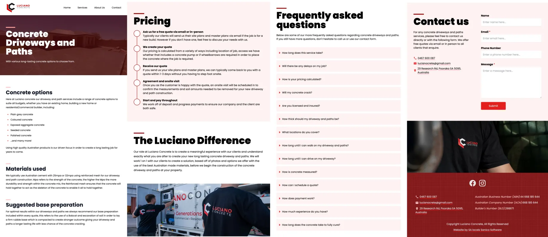
First was the pricing section, which before was just a long paragraph given by Luciano Concrete describing how they come up with a price for their clients’ projects. With blocks of text like this, I like to think of ways to break it down into smaller chunks and visualising it somehow, making it easier to parse quickly without requiring the viewer to read all of it. Since this paragraph described a process, I decided to use a timeline component on the Sanico website to visualise it. This outlines all the main steps, allowing users to get the big picture before further reading the details if they are interested. (Aside: I didn’t commit before changing it to a timeline so that’s why it’s already a timeline in the above screenshot).
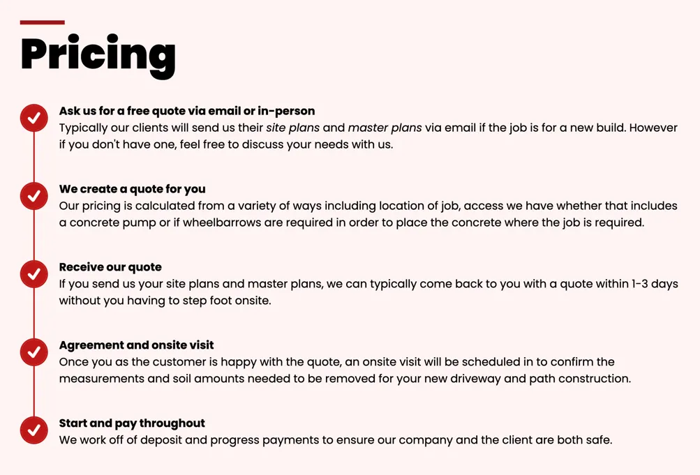
Notice how I transformed the client’s (Luciano Concrete) content, instead of just inserting it verbatim. This was a valuable lesson Sav taught me: I do not have to present the client’s content verbatim when creating a website for them. So long as I keep the actual content (what they are saying), I can present it in a more compelling and succinct way, which actually makes the client happier compared to if I just copied their content verbatim.
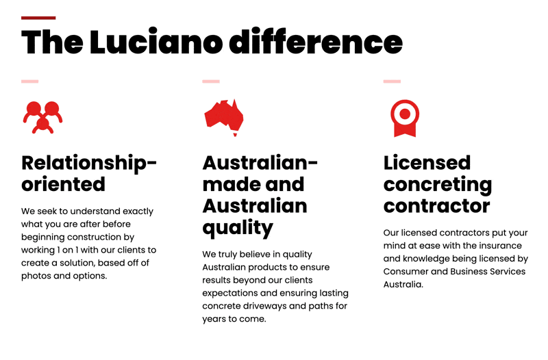
Next up I looked at the differences section, where I applied the same approach to revamping it as with the pricing section. It’s another block of text, and in this case it’s about convincing potential clients that they should choose Luciano Concrete above other concreting companies. Since there was already a differences/values section in the home page, I decided to re-use it here, since it nicely visualises a list of reasons why people should choose them.
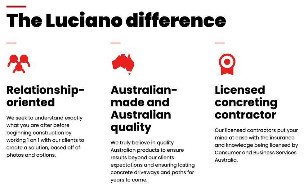
Again here, I did not put their differences paragraph verbatim, but I extracted 3 key differences from that paragraph and presented it in a visual way.
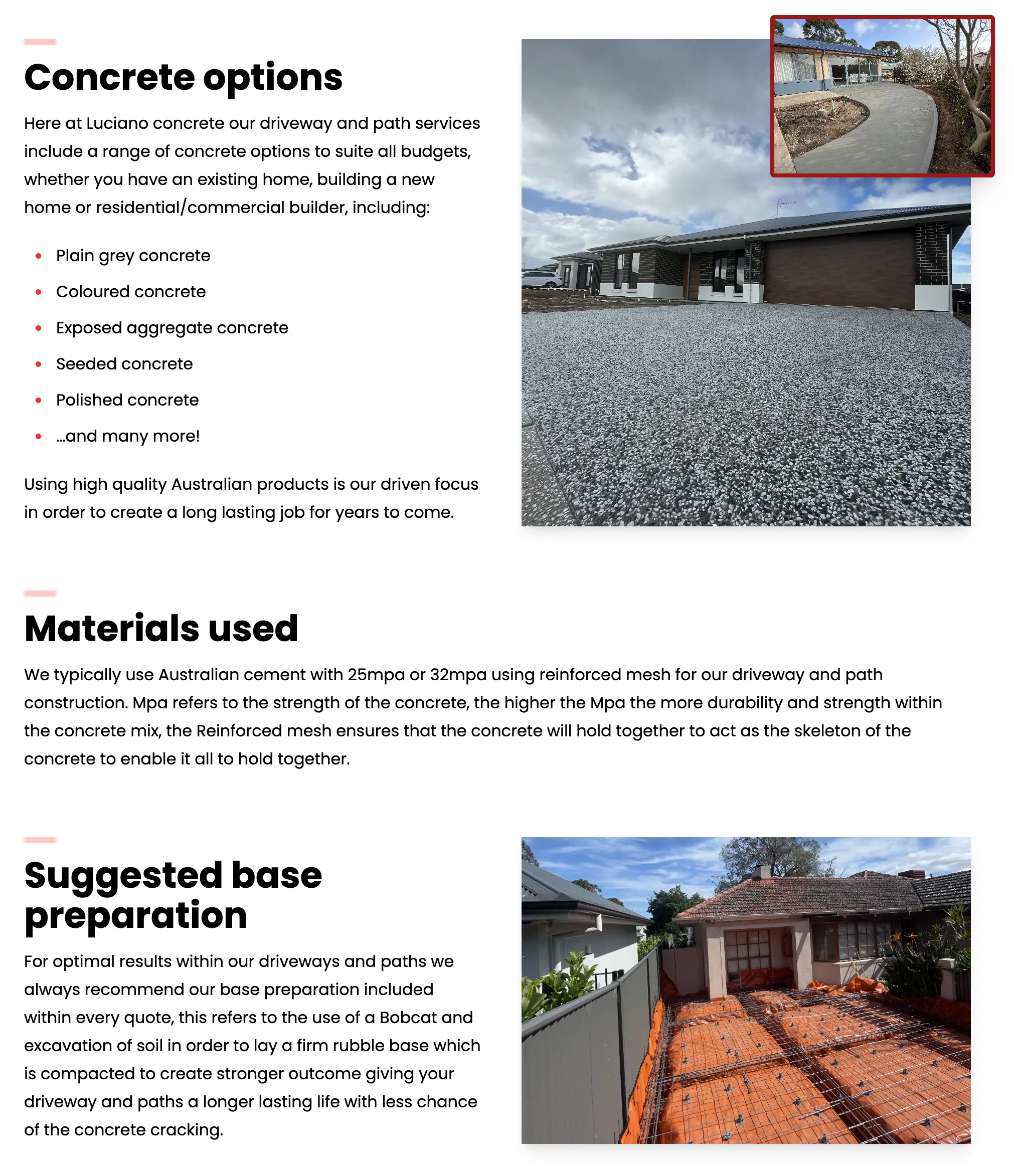
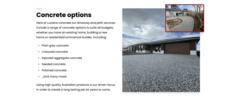
Finally, I looked at the content section, which here is mostly verbatim content from Luciano Concrete, minus some tweaks, including separating it into some subheadings and a bulleted list. This was done using Tailwind CSS’ prose from the typography plugin. Although these large blocks of text are already broken up by those elements, it still was a lot of text, which doesn’t communicate too much on a quick skim. Well, what better way to communicate a lot of content quickly than using images, which people say “is worth a thousand words”! So I added some images in (that they provided) to visualise the service, in this case concrete driveways and paths.
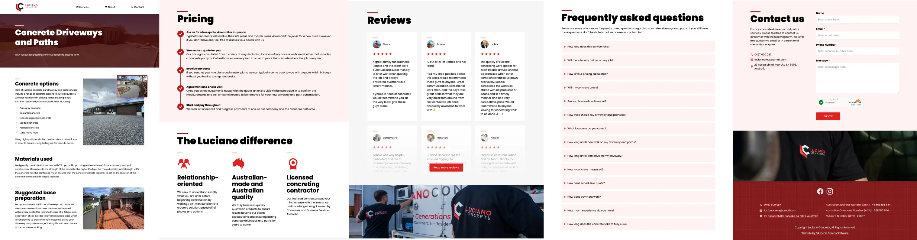
So there you go! There is the finished content section, after revamping the worst sections from the MVP in three iterations, done in time (well, almost; went slightly overtime lol). Doing it all at once is overwhelming, but here I got there by doing it piece-by-piece. Note also the additional reviews section (taken from the home page) as Sav requested; it really does help build credibility!
Finishing touches
With the main service pages done, I asked Sav whether he approved additional time for animations for what he calls the “Nintendo Effect”: putting those little finishing touches that help make a website pop from the rest, making it feel polished and making people think “wow, they really do care about their craft”. And he approved it, so I added animations to some selected sections.
The thing with animations is that it is very easy to over-do; most websites have either no animations or have absolutely everything animated. Thus I try to only add a “tasteful” amount of animations (as Dom, the other co-founder and lead dev, would call it), just to add some motion that flows with the page scroll. In this case, I added it to:
- the images in the content section (sliding in from the right as inspired by Proslabs’ website),
- the differences section (sliding in from the bottom),
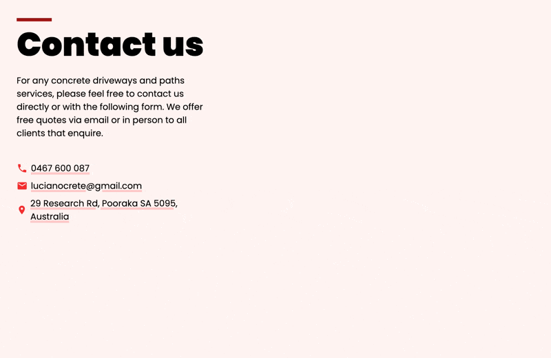
- and the contact form (sliding in from the right).
And with that, it was done and sent off to the client for review.
Concluding remarks
In summary, the service page was made by first looking online for inspiration, then getting an MVP version up and running as quickly as possible with all the client’s content, then iteratively improving the worst sections by breaking up the text blocks with appropriate visualisations and layouts, and finally adding finishing touches to achieve the “Nintendo Effect” using subtle animations.
If you would like to see the service pages for yourself (or any other pages), you can visit the website at https://www.lucianoconcrete.com.au.
Doing things little by little and iteratively is what got me here in the end. Isn’t that what people mean with life too, when people say “take it one day at a time”?